CREATIVE DIRECTION
Kiiroo New Logo Design
Brand Evolution - 2026
Overview
As Kiiroo approached its next phase of growth, the company needed a visual identity that would reflect its position as an industry leader in innovative technology. The existing logo, while recognizable, had remained largely unchanged since 2018 and needed to evolve to better represent the brand's forward-thinking approach.
The rebrand was approached with careful consideration of Kiiroo's brand heritage, ensuring that the new logo would be an evolution rather than a complete departure from the established visual identity.
The result is a refined, contemporary logo that maintains the distinctive rounded rectangle shape while introducing a bolder typeface and more balanced proportions.
Details
- Client
- Kiiroo
- Year
- 2025
- Role
- Creative Director
- Duration
- 3 months
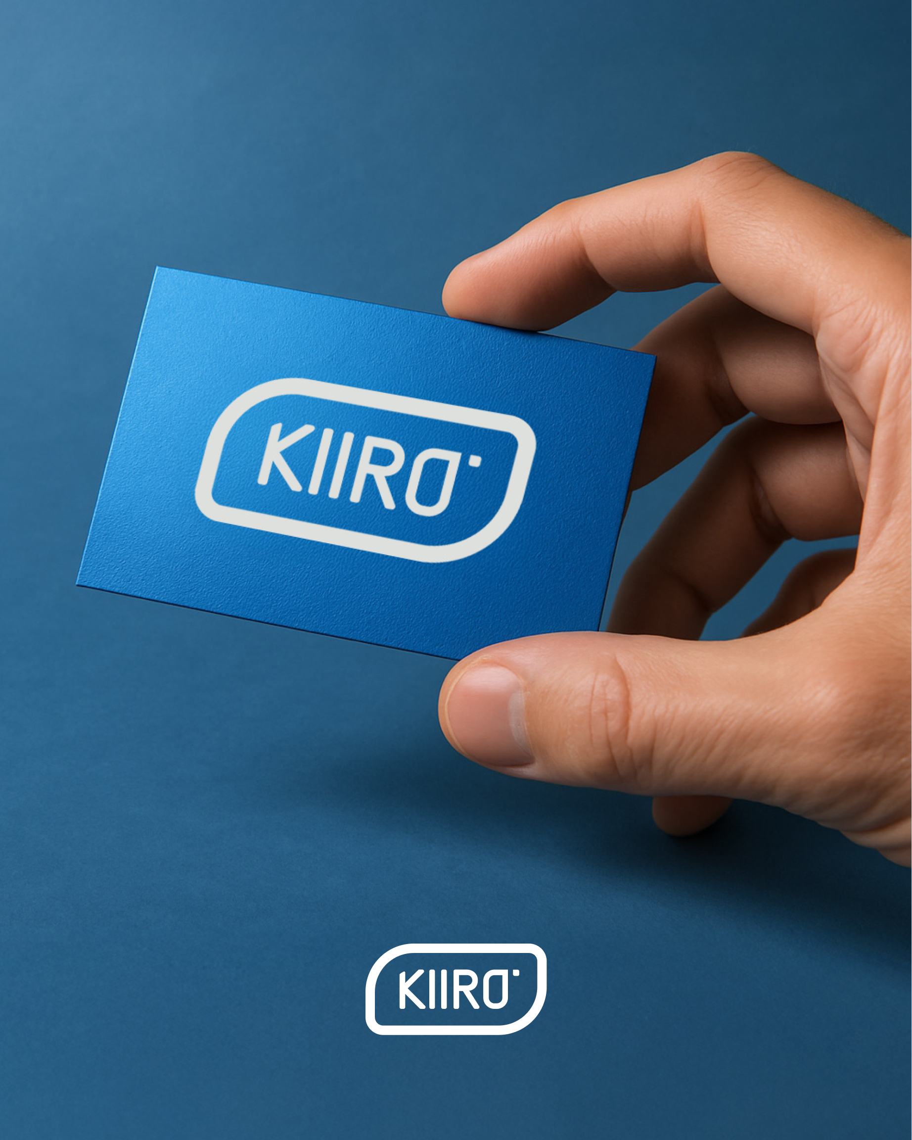
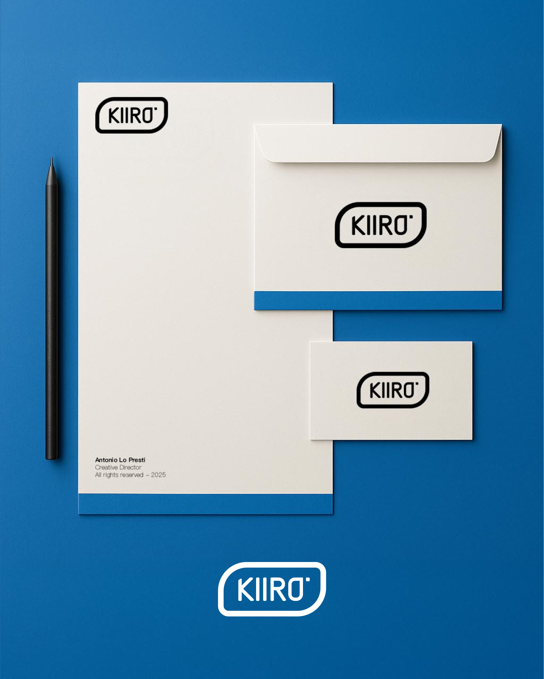
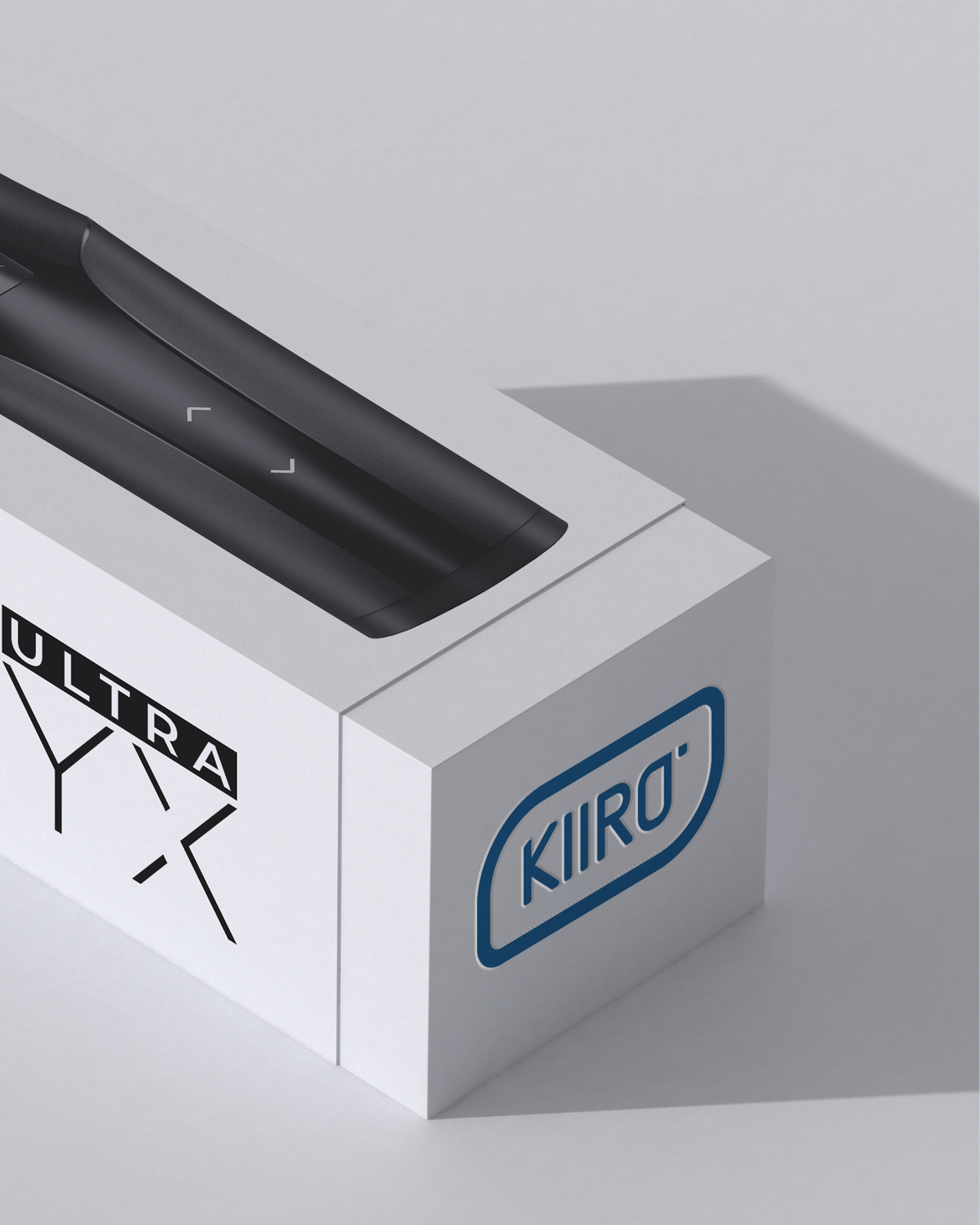
Logo Applications
Design Approach
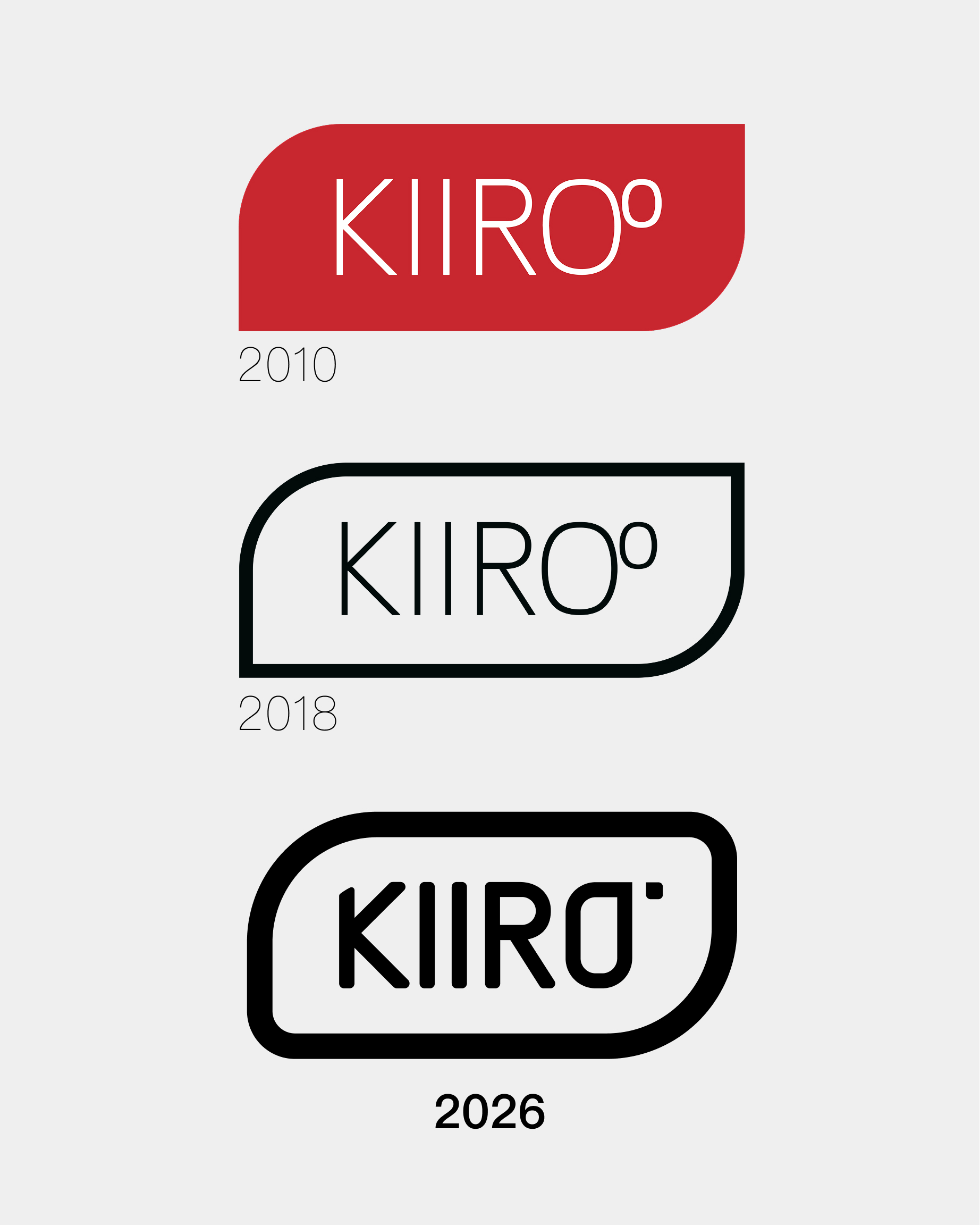
The design process began with an analysis of the logo's evolution since Kiiroo's founding. The original 2010 logo featured a red rounded rectangle with thin typography, which evolved in 2018 to a more minimal black outline with refined letterforms. For the 2026 rebrand, we sought to create a more confident, distinctive mark that would be instantly recognizable.
The design team explored numerous iterations, carefully refining the letterforms and the relationship between the type and the container. The final design achieves a perfect balance between the heritage of the brand and its future direction.
Technical Execution
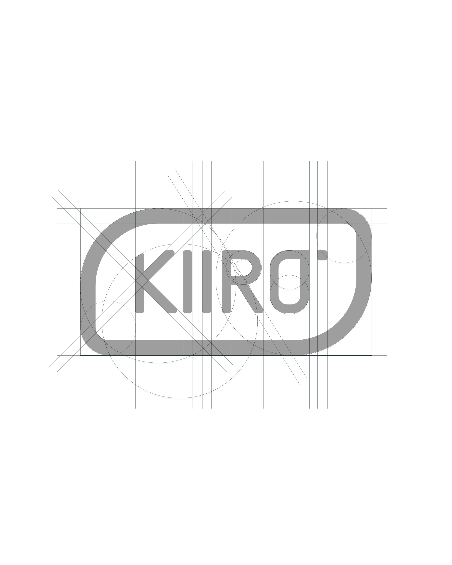
The logo was constructed using precise geometric principles to ensure consistency and scalability across all applications. The grid system provides a framework for the logo's proportions, ensuring that it maintains its integrity at any size.
Special attention was paid to the spacing between letters and the relationship between the type and the container, creating a harmonious balance that feels intentional and refined.
Brand Evolution
The new logo represents the culmination of Kiiroo's brand evolution over more than a decade. From the original 2010 design to the refined 2018 version, and now the bold 2026 redesign, each iteration has built upon the strengths of its predecessor while moving the brand forward.
This evolutionary approach ensures that the brand maintains its recognition and equity while adapting to changing market conditions and consumer expectations. The 2026 logo represents a significant step forward in the brand's visual identity, positioning Kiiroo for continued success in the years ahead.
Outcome
The rebrand has been well-received by both internal stakeholders and customers, reinforcing Kiiroo's position as an innovative, forward-thinking brand in the technology space. The new logo provides a strong foundation for the brand's continued growth and evolution.
By maintaining key elements of the previous logo while introducing refined typography and proportions, the new design achieves the perfect balance between brand recognition and contemporary appeal.
